


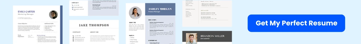
Every detail of your resume matters. While the content showcases your skills and experiences, the formatting—particularly the margins—plays a crucial role in ensuring your resume is both readable and impactful. Properly set margins can enhance the overall presentation, guiding the reader’s eye and making your qualifications stand out.
In this article, we will delve into the significance of resume margins and how they contribute to the first impression you make on potential employers. You’ll learn the optimal margin settings that strike the perfect balance between maximizing space and maintaining a clean, professional look. Whether you’re crafting your first resume or refining an existing one, understanding the nuances of margin settings can elevate your document from ordinary to exceptional.
Join us as we explore the art and science of resume margins, equipping you with the knowledge to create a visually appealing and effective resume that captures attention and opens doors to new opportunities.
Exploring Resume Margins
Definition and Purpose
When crafting a resume, every detail matters, and one of the most critical yet often overlooked aspects is the margin. Margins are the blank spaces that surround the text on a page, and they serve several essential purposes. First and foremost, margins create a visual buffer between the content and the edges of the paper, which helps to enhance readability. A well-defined margin can make a resume look more organized and professional, allowing hiring managers to focus on the content rather than being distracted by cluttered text.
Moreover, margins play a crucial role in the overall layout of the resume. They help to frame the content, guiding the reader’s eye through the document in a logical manner. This is particularly important in a resume, where the goal is to present information clearly and concisely. A resume with appropriate margins can convey a sense of professionalism and attention to detail, qualities that are highly valued by employers.


Standard Margin Sizes
While there is some flexibility in choosing margin sizes for a resume, adhering to standard sizes is generally recommended. The most commonly accepted margin sizes for resumes are:
- 1-inch margins: This is the traditional standard for most documents, including resumes. A 1-inch margin on all sides provides a balanced look and ensures that the text is not too close to the edge of the page, which can be visually unappealing.
- 0.75-inch margins: For those who need to fit more content onto a single page, slightly reducing the margins to 0.75 inches can be effective. This size still maintains a clean appearance while allowing for additional text.
- 0.5-inch margins: In some cases, particularly for resumes that are two pages long, 0.5-inch margins can be used. However, this should be approached with caution, as margins that are too small can make the document feel cramped and difficult to read.
It’s important to note that while these sizes are standard, the choice of margin can also depend on the specific design and layout of the resume. For example, if a resume includes a lot of bullet points or sections, slightly larger margins may help to create a more spacious and less cluttered appearance.
Impact on Readability and Presentation
The impact of margins on readability and presentation cannot be overstated. A resume that is easy to read is more likely to capture the attention of hiring managers, who often spend only a few seconds scanning each document. Here are several ways in which margins influence readability and presentation:
1. Enhancing Visual Hierarchy
Margins help to establish a visual hierarchy within the resume. By providing space around headings, subheadings, and sections, margins allow these elements to stand out. For instance, if the margins are too narrow, the headings may blend into the body text, making it difficult for the reader to quickly identify key sections. Adequate margins create a clear distinction between different parts of the resume, guiding the reader’s eye and making it easier to navigate the document.
2. Reducing Clutter
Cluttered resumes can be overwhelming and off-putting. When margins are too small, the text can appear cramped, leading to a chaotic look that detracts from the overall professionalism of the document. By using appropriate margins, you can create a sense of balance and order, allowing the content to breathe. This not only improves readability but also enhances the overall aesthetic appeal of the resume.
3. Facilitating Annotation
In many cases, hiring managers may print out resumes for review. Having adequate margins allows space for notes or annotations, which can be beneficial during the selection process. If a resume is too tightly packed, there may be no room for comments, making it less likely that the document will be thoroughly reviewed. By providing sufficient margins, you create an opportunity for interaction and engagement with the content.


4. Adapting to Different Formats
Resumes may be submitted in various formats, including digital and printed versions. Standard margin sizes ensure that the document maintains its integrity across different platforms. For example, a resume that looks great on a computer screen may not translate well to print if the margins are too narrow. By adhering to standard margin sizes, you can ensure that your resume looks professional regardless of how it is viewed.
5. Reflecting Professionalism
Finally, the choice of margins can reflect your professionalism and attention to detail. A resume with well-defined margins conveys that you have taken the time to consider the layout and presentation of your document. This attention to detail can leave a positive impression on hiring managers, who are often looking for candidates who demonstrate professionalism in all aspects of their work.
Practical Tips for Setting Resume Margins
Now that we understand the importance of margins, here are some practical tips for setting them effectively:
- Use a Word Processor: Most word processing software, such as Microsoft Word or Google Docs, allows you to easily adjust margins. Familiarize yourself with the settings to ensure you can create the desired layout.
- Preview Before Printing: Always preview your resume before printing or submitting it. This will help you identify any issues with margins or layout that may not be apparent on the screen.
- Consider Your Content: If you have a lot of information to include, consider using bullet points or concise phrases to maximize space without sacrificing readability. Adjust margins accordingly to create a balanced look.
- Test Different Sizes: Don’t be afraid to experiment with different margin sizes. What works for one resume may not work for another, so take the time to find the right balance for your specific content.
- Seek Feedback: If possible, ask a trusted friend or mentor to review your resume. They can provide valuable feedback on the overall presentation, including the effectiveness of your margin choices.
Margins are a fundamental aspect of resume design that significantly impacts readability and presentation. By understanding their purpose, adhering to standard sizes, and considering their influence on the overall layout, you can create a resume that not only looks professional but also effectively communicates your qualifications to potential employers.
Optimal Margin Sizes for Different Resume Formats
When crafting a resume, the layout is just as important as the content. One of the most critical aspects of layout is the margin size. Margins not only frame your content but also influence readability and the overall impression your resume makes on potential employers. Different resume formats require different margin sizes to achieve optimal readability and impact. We will explore the ideal margin sizes for traditional, creative, and digital resumes, providing insights and examples to help you make informed decisions.


Traditional Resumes
Traditional resumes are typically structured and straightforward, often used in more conservative industries such as finance, law, and education. The goal of a traditional resume is to present information clearly and professionally. For this format, the recommended margin size is generally between 0.5 inches to 1 inch on all sides.
Using 1-inch margins is a safe choice that provides ample white space, making the document easy to read. This margin size allows for a clean layout, ensuring that the text does not appear cramped. However, if you need to fit more information onto a single page, you can reduce the margins to 0.75 inches or even 0.5 inches, but be cautious not to go below this threshold, as it may compromise readability.
For example, a traditional resume with 1-inch margins might look like this:
John Doe
123 Main St, Anytown, USA
(123) 456-7890
[email protected]

Objective
Dedicated professional seeking a position in...

Experience
Company Name, Job Title, Dates
- Responsibility 1
- Responsibility 2

Education
Degree, Major, University, Graduation Date
In this layout, the 1-inch margins create a balanced appearance, allowing the reader to focus on the content without feeling overwhelmed. Remember, the key to a successful traditional resume is clarity and professionalism.
Creative Resumes
Creative resumes are designed to showcase an applicant’s personality and creativity, often used in fields such as graphic design, marketing, and the arts. These resumes can incorporate unique layouts, colors, and graphics, which can influence margin choices. For creative resumes, the margin size can vary more significantly, but a range of 0.5 inches to 1 inch is still advisable.
While you can experiment with smaller margins to create a more dynamic layout, it’s essential to maintain readability. A margin of 0.5 inches can work well if you have a visually engaging design that draws the reader’s eye. However, if your resume includes intricate graphics or images, consider using 0.75 inches to ensure that the text remains legible and does not feel cramped.
For instance, a creative resume might feature a unique header with a bold font and a splash of color, while the body text is neatly organized with 0.5-inch margins:

[Creative Header with Name and Title]
[Colorful Graphic or Logo]

Experience
Company Name, Job Title, Dates
- Creative Responsibility 1
- Creative Responsibility 2

Skills
- Skill 1
- Skill 2
In this example, the smaller margins allow for a more engaging design while still keeping the text readable. The key is to balance creativity with clarity, ensuring that the resume remains professional while showcasing your unique style.
Digital Resumes
With the rise of technology, digital resumes have become increasingly popular. These resumes are often submitted online or shared via email, and they may be viewed on various devices, including computers, tablets, and smartphones. Because of this versatility, the margin size for digital resumes should prioritize readability across different screen sizes. A margin size of 0.5 inches to 0.75 inches is generally recommended for digital formats.
Using 0.5-inch margins can be effective for digital resumes, as it allows you to maximize the use of space while still maintaining a clean look. However, if your resume includes a lot of text or detailed information, consider using 0.75-inch margins to enhance readability on smaller screens.
For example, a digital resume might be formatted as follows:
John Doe
[LinkedIn Profile URL]
[Personal Website URL]

Summary
Results-driven professional with expertise in...

Experience
Company Name, Job Title, Dates
- Key Achievement 1
- Key Achievement 2

Education
Degree, Major, University, Graduation Date
In this layout, the 0.5-inch margins help to keep the content organized and easy to read, even on smaller devices. Additionally, including links to your LinkedIn profile or personal website can enhance your digital presence and provide further context to your qualifications.
General Tips for Setting Margins
Regardless of the resume format you choose, here are some general tips to keep in mind when setting margins:
- Consistency is Key: Ensure that your margins are consistent throughout the document. Inconsistent margins can create a disjointed appearance and distract from the content.
- Test Readability: Before finalizing your resume, print it out or view it on different devices to ensure that the text is easy to read. Adjust margins as necessary based on your observations.
- Consider Your Content: If you have a lot of information to convey, you may need to adjust your margins accordingly. However, always prioritize readability over cramming in too much content.
- Use White Space Wisely: White space is essential for guiding the reader’s eye and making your resume more visually appealing. Ensure that your margins contribute to a balanced layout.
By understanding the optimal margin sizes for different resume formats, you can create a document that not only looks professional but also enhances your chances of making a positive impression on potential employers. Whether you opt for a traditional, creative, or digital resume, the right margins will help you present your qualifications effectively and attractively.
How to Set Resume Margins in Various Software
When crafting a resume, the layout is just as important as the content. One of the key elements of a well-structured resume is the margin settings. Margins not only affect the overall appearance of your document but also play a crucial role in readability and the impression you leave on potential employers. We will explore how to set resume margins in various software applications, including Microsoft Word, Google Docs, Adobe InDesign, and other popular tools.
Microsoft Word
Microsoft Word is one of the most widely used word processing applications, making it essential for job seekers to know how to adjust margins effectively. Here’s how to set your resume margins in Microsoft Word:
- Open your resume document: Launch Microsoft Word and open the document you wish to edit.
- Access the Page Layout tab: Navigate to the top menu and click on the Layout tab (or Page Layout in some versions).
- Select Margins: In the Page Setup group, click on the Margins button. A dropdown menu will appear with several preset margin options.
- Choose a preset or customize: You can select one of the predefined options such as Normal (1 inch on all sides), Narrow (0.5 inches), or Wide (1 inch top and bottom, 2 inches left and right). For a more tailored approach, click on Custom Margins at the bottom of the dropdown.
- Set custom margins: In the Page Setup dialog box, you can enter specific values for the top, bottom, left, and right margins. A common recommendation for resumes is to set the margins to 0.75 inches or 1 inch, depending on the amount of content you have.
- Apply the changes: After setting your desired margins, click OK to apply the changes to your document.
By following these steps, you can ensure that your resume has the right balance of white space and content, enhancing its overall readability.
Google Docs
Google Docs is another popular tool for creating resumes, especially for those who prefer a cloud-based solution. Here’s how to set margins in Google Docs:
- Open your document: Go to Google Docs and open the resume you want to edit.
- Access the File menu: Click on File in the top left corner of the screen.
- Select Page setup: From the dropdown menu, choose Page setup. This will open a dialog box where you can adjust various page settings.
- Adjust margins: In the Page setup dialog, you will see fields for Top, Bottom, Left, and Right margins. Enter your desired margin sizes. A standard setting is 1 inch, but you can adjust it to 0.75 inches if you need more space for content.
- Set as default (optional): If you want these margin settings to apply to all future documents, click on the Set as default button before clicking OK.
Google Docs automatically saves your changes, so you can see the impact of your margin adjustments immediately. This flexibility allows you to experiment with different settings until you find the perfect balance for your resume.


Adobe InDesign
For those looking to create a more visually appealing resume, Adobe InDesign offers advanced layout options. Here’s how to set margins in InDesign:
- Create a new document: Open Adobe InDesign and create a new document by selecting File > New > Document.
- Set margins during document setup: In the New Document dialog box, you will see options for Margins. Enter your desired values for the top, bottom, left, and right margins. A common choice is 0.5 to 1 inch, depending on your design.
- Adjust margins later (if needed): If you need to change the margins after creating the document, go to Layout > Margins and Columns. Here, you can adjust the margin settings as needed.
- Utilize guides for precision: InDesign allows you to create guides that can help you maintain consistent spacing throughout your resume. You can drag guides from the rulers on the top and left sides of the workspace to align your content effectively.
Adobe InDesign is particularly useful for those who want to incorporate graphics or unique layouts into their resumes. The ability to customize margins and use guides can help create a polished and professional look.
Other Popular Tools
Aside from Microsoft Word, Google Docs, and Adobe InDesign, there are several other tools that job seekers can use to create resumes. Here’s a brief overview of how to set margins in some of these popular applications:
Canva
Canva is a user-friendly graphic design tool that offers a variety of resume templates. To set margins in Canva:
- Select a template: Choose a resume template that suits your style.
- Adjust the canvas size: Click on Resize in the top menu to set custom dimensions, which indirectly affects the margins.
- Use guides: Drag guides from the rulers to create visual margins, ensuring your content is well-aligned.
Apple Pages
For Mac users, Apple Pages is a great alternative. To set margins:
- Open your document: Launch Pages and open your resume.
- Access Document Setup: Click on the Document button in the toolbar.
- Adjust margins: In the Document sidebar, you can set the top, bottom, left, and right margins to your desired sizes.
LibreOffice Writer
LibreOffice Writer is a free alternative to Microsoft Word. To set margins:

- Open your document: Launch LibreOffice Writer and open your resume.
- Access Page Styles: Right-click on the page and select Page Style.
- Adjust margins: In the Page Style dialog, navigate to the Page tab and set your desired margins.
Regardless of the software you choose, the principles of setting effective margins remain the same. Aim for a balance that enhances readability while allowing you to present your qualifications clearly and professionally. Remember, the goal is to create a resume that stands out for its content and its presentation.
Balancing Content and White Space
The Role of White Space in Design
White space, often referred to as negative space, is the area of a design that is left unmarked. It is not merely a void; rather, it plays a crucial role in enhancing the overall readability and aesthetic appeal of a document, including resumes. In the context of a resume, white space can significantly influence how hiring managers perceive your qualifications and professionalism.
When it comes to resumes, the effective use of white space can help to:
- Guide the Reader’s Eye: White space helps to create a visual hierarchy, allowing the reader to navigate through the document effortlessly. By strategically placing white space around sections, headings, and bullet points, you can direct attention to the most important information.
- Improve Readability: A cluttered resume can overwhelm the reader, making it difficult to absorb the information presented. Adequate white space can break up text blocks, making it easier for hiring managers to scan your resume quickly.
- Convey Professionalism: A well-organized resume with ample white space reflects a polished and professional image. It suggests that you value clarity and are considerate of the reader’s experience.
To achieve the right balance, consider using margins, line spacing, and paragraph spacing effectively. For instance, a standard margin of 1 inch on all sides is a good starting point, but you can adjust this based on the amount of content you have. If your resume is content-heavy, slightly reducing the margins can help fit more information without sacrificing readability.
Avoiding Cluttered Layouts
A cluttered layout can detract from the impact of your resume. When designing your resume, it’s essential to avoid cramming too much information into a small space. Here are some strategies to prevent clutter:
- Limit the Use of Fonts: Stick to one or two fonts throughout your resume. Using multiple fonts can create visual chaos. Choose a clean, professional font for the body text (like Arial, Calibri, or Times New Roman) and a slightly different font for headings to create contrast.
- Use Bullet Points Wisely: Bullet points are an excellent way to present information clearly. However, overusing them can lead to a cluttered appearance. Aim for concise bullet points that highlight your achievements and responsibilities without overwhelming the reader.
- Prioritize Information: Not all information is equally important. Use white space to emphasize key achievements and skills. For example, if you have a particularly impressive accomplishment, consider placing it in a separate section or using a larger font size to draw attention.
- Group Related Information: Organize your resume into clear sections (e.g., Work Experience, Education, Skills) and use white space to separate these sections. This organization helps the reader quickly locate relevant information without feeling overwhelmed.
Additionally, consider the overall layout of your resume. A traditional chronological format may work for some, but a functional or combination format can help you highlight your skills and achievements more effectively, especially if you have gaps in your employment history or are changing careers.
Enhancing Visual Appeal
Visual appeal is a critical factor in making your resume stand out. While content is king, the way that content is presented can make a significant difference in how it is received. Here are some tips to enhance the visual appeal of your resume through the effective use of white space:
- Consistent Alignment: Ensure that all text is consistently aligned. Left alignment is generally the most readable, but you can use center alignment for headings to create a more polished look. Avoid right alignment, as it can make text harder to read.
- Strategic Use of Color: While black and white is the safest choice for resumes, a touch of color can enhance visual appeal. Use color sparingly for headings or to highlight key sections. Ensure that the colors you choose are professional and easy to read.
- Incorporate Visual Elements: Consider adding subtle visual elements, such as lines or boxes, to separate sections. This can create a more organized look without cluttering the layout. However, be cautious not to overdo it; the goal is to enhance, not distract.
- Whitespace as a Design Element: Use white space intentionally as a design element. For example, if you have a particularly long section, consider adding extra space before and after it to give the reader a visual break. This technique can help maintain engagement and prevent fatigue.
Ultimately, the goal of balancing content and white space is to create a resume that is not only informative but also visually appealing. A well-structured resume with appropriate margins and spacing can make a lasting impression on hiring managers, increasing your chances of landing an interview.
The effective use of white space is essential for creating a resume that stands out. By understanding the role of white space in design, avoiding cluttered layouts, and enhancing visual appeal, you can craft a resume that is both readable and impactful. Remember, your resume is often the first impression you make on potential employers, so investing time in its design can pay off significantly in your job search.
Adjusting Margins for Different Content Types
When crafting a resume, the layout is just as important as the content. One of the most critical aspects of layout is the margin settings. Margins not only frame your content but also influence readability and the overall impression your resume makes on potential employers. Different types of resumes—text-heavy, visual, infographic, and hybrid—require different margin adjustments to optimize their effectiveness. We will explore how to set margins for each of these content types to ensure your resume stands out for all the right reasons.
Text-Heavy Resumes
Text-heavy resumes are the most traditional format, often favored by industries that prioritize clarity and straightforwardness, such as finance, law, and academia. These resumes typically contain a lot of information, including detailed job descriptions, educational backgrounds, and skills. Therefore, setting the right margins is crucial to ensure that the text is easy to read and does not overwhelm the reader.
Recommended Margin Settings: For text-heavy resumes, a margin of 1 inch on all sides is generally recommended. This standard margin size provides a balanced look and ensures that the text does not appear cramped. However, if you find that your resume exceeds one page, you can consider reducing the margins slightly to 0.75 inches. This adjustment can help you fit more content without sacrificing readability.
Example: If you have a resume that is currently one page but is spilling over to a second page, try adjusting the margins to 0.75 inches. This small change can often provide the extra space needed to keep your resume concise while still maintaining a professional appearance.
Additionally, ensure that your font size is appropriate—typically between 10 and 12 points for the body text. A larger font size may require wider margins, while a smaller font can allow for narrower margins. Always prioritize readability; if the text looks cramped, it may be worth sacrificing some content to maintain a clean layout.
Visual and Infographic Resumes
Visual and infographic resumes are becoming increasingly popular, especially in creative fields such as graphic design, marketing, and advertising. These resumes utilize graphics, colors, and unique layouts to convey information in a visually appealing manner. While creativity is key, it’s essential to maintain a balance between aesthetics and readability.
Recommended Margin Settings: For visual resumes, you can experiment with margins ranging from 0.5 to 1 inch. A margin of 0.5 inches can allow for more creative space, enabling you to incorporate graphics and images without making the resume feel cluttered. However, be cautious not to go too narrow, as this can lead to a chaotic appearance that detracts from the overall message.
Example: If you are designing a visual resume that includes a large header image and several icons to represent your skills, consider setting your margins to 0.5 inches. This will give you the flexibility to arrange your content creatively while still providing enough white space to keep the design clean and professional.
When using visuals, ensure that they complement the text rather than overwhelm it. Use bullet points and short phrases to convey information succinctly, and avoid long paragraphs. The goal is to create a resume that is easy to skim while still providing enough detail to showcase your qualifications.
Hybrid Resumes
Hybrid resumes combine elements of both text-heavy and visual formats, making them versatile and suitable for a wide range of industries. This format typically includes a mix of traditional text sections and visual elements, such as icons or color-coded sections. The challenge with hybrid resumes is finding the right balance between text and visuals while ensuring that the layout remains clean and professional.
Recommended Margin Settings: For hybrid resumes, a margin of 0.75 to 1 inch is ideal. This range allows for enough space to incorporate visual elements without compromising the readability of the text. If you are using more visuals, you might lean towards the 0.75-inch margin, but if your resume is more text-heavy, stick with the 1-inch margin.
Example: If your hybrid resume includes a section with icons representing your skills alongside a detailed work experience section, consider using 0.75-inch margins. This will give you the flexibility to include the icons while still providing ample space for the text, ensuring that both elements are easily readable.
When designing a hybrid resume, it’s essential to maintain a consistent style throughout. Use the same font and color scheme for both text and visual elements to create a cohesive look. Additionally, ensure that the visual elements do not distract from the content; they should enhance the information rather than overshadow it.
General Tips for Setting Margins
Regardless of the type of resume you are creating, here are some general tips to keep in mind when setting margins:
- Consistency is Key: Ensure that your margins are consistent throughout the document. Inconsistent margins can make your resume look unprofessional and disorganized.
- Use White Space Wisely: White space is crucial for readability. Avoid cramming too much information into a small area; instead, allow for breathing room around your text and visuals.
- Test Print Your Resume: Before sending out your resume, print it out to see how it looks on paper. Sometimes, what appears visually appealing on a screen may not translate well to print.
- Consider the Industry: Tailor your margin settings based on the industry you are applying to. Creative fields may allow for more flexibility, while traditional industries may require a more conservative approach.
By carefully adjusting your margins based on the type of content in your resume, you can enhance its readability and impact. Whether you opt for a text-heavy, visual, or hybrid format, the right margin settings will help ensure that your resume effectively communicates your qualifications and makes a lasting impression on potential employers.
Common Mistakes to Avoid
Overly Narrow Margins
One of the most common mistakes job seekers make when formatting their resumes is setting margins that are too narrow. While it may seem like a good idea to maximize space and fit more information on a single page, overly narrow margins can lead to several issues that detract from the overall readability and professionalism of your resume.
When margins are set below the standard 0.5 inches, the text can appear cramped and overwhelming. This can make it difficult for hiring managers to quickly scan your resume, which is crucial given that they often spend only a few seconds on an initial review. A cluttered appearance can also give the impression that you are trying to hide a lack of experience or qualifications by cramming in too much information.
For example, consider a resume with 0.25-inch margins. The text may extend too close to the edges of the page, making it visually unappealing. In contrast, a resume with 0.5-inch margins provides a clean, organized look that allows the reader to focus on the content rather than being distracted by the layout.
To avoid this mistake, aim for a margin size of at least 0.5 inches on all sides. This not only enhances readability but also gives your resume a more polished and professional appearance. If you have a lot of information to convey, consider using bullet points, concise language, and strategic formatting to make the most of the space without compromising on margin size.
Excessively Wide Margins
On the flip side, setting excessively wide margins can also be detrimental to your resume’s effectiveness. While it’s important to ensure that your resume is not overcrowded, margins that are too wide can create an imbalance in the layout and lead to wasted space. This can be particularly problematic if you are trying to fit your resume onto a single page, which is often the preferred length for most job applications.
For instance, if you set your margins to 1 inch or more, you may find that you have ample white space on the page, but not enough content to fill it. This can give the impression that you lack experience or qualifications, as a sparse resume may suggest that you have little to offer. Additionally, hiring managers may perceive wide margins as a sign of poor formatting skills, which can further diminish your chances of making a positive impression.
To strike the right balance, consider using margins of 0.5 to 0.75 inches. This range allows for sufficient white space to enhance readability while still providing enough room for your content. If you find that your resume is still too long, focus on condensing your information rather than expanding your margins. Use concise language, prioritize relevant experiences, and eliminate any unnecessary details to create a more impactful resume.
Inconsistent Margins
Another common mistake that can undermine the professionalism of your resume is the use of inconsistent margins. This can occur when different sections of your resume have varying margin sizes, leading to a disjointed and unprofessional appearance. Inconsistent margins can confuse the reader and make it difficult for them to follow the flow of your resume, which can ultimately detract from your overall message.
For example, if the header of your resume has 1-inch margins, but the body text is set to 0.5 inches, the visual inconsistency can be jarring. This not only disrupts the reader’s experience but can also signal a lack of attention to detail, which is a critical quality that employers look for in candidates.
To avoid this pitfall, ensure that your margins are consistent throughout your resume. Stick to a single margin size for all sections, including headers, body text, and footers. This creates a cohesive look that enhances the overall professionalism of your document. If you are using a template, double-check the margin settings to ensure they are uniform across the entire resume.
Additional Tips for Margin Management
In addition to avoiding the common mistakes outlined above, here are some additional tips for managing margins effectively on your resume:
- Use a Standard Page Size: Stick to standard page sizes, such as 8.5 x 11 inches, to ensure that your margins are set appropriately. This is the most common size for resumes and is widely accepted by employers.
- Preview Your Resume: Before sending out your resume, always preview it in print layout mode. This will give you a better idea of how the margins look on paper and whether any adjustments are needed.
- Consider the Font Size: The font size you choose can also impact how your margins appear. A larger font may require wider margins to maintain a balanced look, while a smaller font can allow for narrower margins without compromising readability.
- Utilize White Space Wisely: White space is an essential element of design that can enhance readability. Use it strategically by incorporating it between sections, headings, and bullet points to create a visually appealing layout.
- Test Different Formats: If you’re unsure about your margin settings, experiment with different formats. Create multiple versions of your resume with varying margin sizes and ask for feedback from peers or mentors.
By being mindful of these common mistakes and implementing best practices for margin management, you can create a resume that is not only visually appealing but also effectively communicates your qualifications and experiences to potential employers. Remember, your resume is often the first impression you make, so investing time in its layout and formatting can significantly impact your job search success.
Advanced Tips for Customizing Margins
Tailoring Margins for Specific Industries
When crafting a resume, understanding the nuances of the industry you are applying to can significantly influence how you set your margins. Different fields have varying expectations regarding format and presentation, and your margins can play a crucial role in meeting these expectations.
For instance, in creative industries such as graphic design, marketing, or advertising, a more unconventional approach to margins can be beneficial. Designers might opt for wider margins to create a more spacious layout, allowing for the inclusion of graphics or unique design elements. This not only showcases their creativity but also makes the resume visually appealing. A margin of 1.5 inches on the left and right can provide ample space for creative elements while maintaining readability.
Conversely, in more traditional fields such as finance, law, or academia, a conservative approach is often preferred. Here, standard margins of 1 inch on all sides are typically recommended. This format conveys professionalism and ensures that the content remains the focal point. In these industries, clarity and conciseness are paramount, and excessive white space can detract from the information presented.
Additionally, consider the specific role you are applying for within the industry. For example, if you are applying for a position that emphasizes attention to detail, such as a project manager or an accountant, maintaining standard margins can reflect your ability to adhere to guidelines and present information clearly. On the other hand, if you are applying for a role that values innovation, such as a product designer, experimenting with margins can help your resume stand out.
Adjusting Margins for Different Resume Lengths
The length of your resume can also dictate how you set your margins. Generally, resumes should be concise, ideally fitting onto one page for early-career professionals and extending to two pages for those with more extensive experience. However, the way you adjust your margins can help you manage the content effectively without sacrificing readability.
For a one-page resume, standard margins of 1 inch on all sides are typically sufficient. This allows for a clean layout that is easy to read while providing enough space for essential information. However, if you find yourself struggling to fit all your relevant experience and skills onto one page, consider slightly reducing the margins to 0.75 inches. This small adjustment can create additional space without making the document feel cramped.
For two-page resumes, maintaining 1-inch margins on the first page is advisable, as it sets a professional tone. On the second page, you might consider reducing the bottom margin to 0.5 inches if you need to fit more content. However, be cautious not to overdo it; margins that are too narrow can make the text feel overwhelming and difficult to read. A good rule of thumb is to ensure that the text remains comfortably within the page, avoiding any risk of it being cut off when printed or viewed on different devices.
Another strategy for longer resumes is to utilize section breaks effectively. By adjusting the margins for specific sections, you can create a visual hierarchy that guides the reader’s eye. For example, if you have a particularly dense section, such as a list of publications or projects, consider increasing the left margin to 1.25 inches for that section. This subtle change can help differentiate it from the rest of the content, making it easier for hiring managers to scan through your qualifications.
Using Margins to Highlight Key Sections
Margins can also be strategically used to highlight key sections of your resume, drawing attention to the most important information. This technique can be particularly effective in ensuring that hiring managers notice your most relevant skills and experiences at a glance.
One effective method is to create a visual distinction between sections by adjusting the margins. For instance, if you want to emphasize your skills section, you might increase the left margin to 1.5 inches while keeping the right margin at 1 inch. This creates a visual cue that signals to the reader that this section is important. Additionally, consider using bold headings or a different font style to further enhance the visibility of this section.
Another approach is to use a combination of margin adjustments and white space. By increasing the top margin of a section, you can create a buffer that separates it from the preceding content. This not only highlights the section but also makes it easier for the reader to digest the information. For example, if you have a summary statement at the top of your resume, increasing the top margin to 1.5 inches can help it stand out as a focal point.
Furthermore, consider using bullet points or short paragraphs within sections that you want to highlight. This can be particularly effective in the experience section, where you can use narrower margins to create a more compact layout. By doing so, you can present your accomplishments in a way that is both visually appealing and easy to read. For example, if you have a series of achievements that you want to showcase, you might set the left margin to 0.75 inches and use bullet points to list them succinctly.
Lastly, remember that consistency is key. While it’s important to use margins to highlight specific sections, ensure that your overall layout remains cohesive. Inconsistent margin settings can create a disjointed appearance, making it difficult for the reader to follow your narrative. Aim for a balanced approach that enhances readability while still allowing you to draw attention to your most significant qualifications.
Customizing your resume margins is a powerful tool that can enhance both readability and impact. By tailoring margins to specific industries, adjusting them based on resume length, and using them strategically to highlight key sections, you can create a resume that not only looks professional but also effectively communicates your qualifications to potential employers.
Testing and Reviewing Your Resume Margins
When it comes to crafting a resume, every detail matters, and that includes the margins. Margins are the blank spaces that surround your content, and they play a crucial role in the overall readability and aesthetic appeal of your document. After setting your margins, it’s essential to test and review them to ensure they enhance your resume rather than detract from it. This section will explore the importance of testing your resume margins through various methods, including print versus digital reviews, gathering feedback from peers and professionals, and utilizing tools for margin adjustment and review.
Print vs. Digital Review
In today’s job market, resumes are often submitted in both digital and printed formats. Therefore, it’s vital to review your resume in both contexts to ensure that your margins work effectively in each medium.
Digital Review
When reviewing your resume digitally, consider the following:
- Screen Size Variability: Resumes can be viewed on various devices, from smartphones to large monitors. Ensure that your margins are set to accommodate different screen sizes. A margin that looks good on a desktop may appear cramped on a mobile device.
- PDF Format: Save your resume as a PDF before sending it out. This format preserves your formatting, including margins, across different devices and operating systems. Open the PDF on multiple devices to see how the margins appear.
- Zoom Levels: When reviewing your resume on a computer, adjust the zoom level to 100% to see how it will look to potential employers. This can help you identify any issues with spacing or layout that may not be apparent at different zoom levels.
Print Review
Printing your resume is equally important. Here’s why:
- Physical Presentation: A printed resume is often the first impression you make in an interview. Ensure that your margins create a clean, professional look. Print your resume on high-quality paper to enhance its visual appeal.
- Readability: Margins that are too narrow can make your resume feel cluttered and overwhelming. A printed version allows you to assess the readability of your content. If the text feels cramped, consider adjusting your margins.
- Final Touches: After printing, take a moment to review the physical document. Look for any formatting issues that may have arisen during the printing process, such as text being cut off or misaligned.
Feedback from Peers and Professionals
One of the most effective ways to ensure your resume margins are optimal is to seek feedback from others. Here’s how to approach this:
Peer Review
Sharing your resume with friends or colleagues can provide valuable insights. When asking for feedback, consider the following:
- Specific Questions: Instead of asking for general feedback, pose specific questions about your margins. For example, “Do the margins make the text easy to read?” or “Does the layout feel balanced?” This can help guide their feedback.
- Diverse Perspectives: Seek feedback from individuals in different fields or industries. What works for one profession may not work for another. A graphic designer may have different expectations for layout compared to a finance professional.
Professional Review
If possible, consider consulting a career coach or resume expert. They can provide professional insights into industry standards and best practices. Here’s what to keep in mind:
- Industry Standards: Different industries may have varying expectations regarding resume formatting. A professional can help you align your margins with industry norms.
- Constructive Criticism: Be open to constructive criticism. Professionals may point out issues you hadn’t considered, such as how your margins affect the overall flow of your resume.
Tools for Margin Adjustment and Review
In addition to manual reviews, several tools can assist you in adjusting and reviewing your resume margins effectively:
Word Processing Software
Most word processing software, such as Microsoft Word or Google Docs, offers built-in tools for adjusting margins. Here’s how to use them:
- Accessing Margin Settings: In Microsoft Word, go to the “Layout” tab and click on “Margins.” You can choose from preset options or create custom margins. In Google Docs, navigate to “File,” then “Page setup” to adjust your margins.
- Preview Function: Use the print preview function to see how your margins will look before printing. This feature allows you to make adjustments without wasting paper.
Margin Measurement Tools
For those who want to ensure precision, consider using margin measurement tools. These can help you set exact measurements for your margins:
- Ruler Tools: Some word processors have a ruler feature that allows you to drag and set margins visually. This can be particularly helpful for achieving a balanced layout.
- Online Margin Calculators: There are online tools available that can help you calculate the best margin sizes based on your resume length and content. These calculators can provide recommendations for optimal readability.
Testing and reviewing your resume margins is a critical step in the resume creation process. By conducting thorough digital and print reviews, seeking feedback from peers and professionals, and utilizing various tools for margin adjustment, you can ensure that your resume is not only visually appealing but also easy to read. Remember, the goal is to create a document that effectively showcases your skills and experiences while making a strong impression on potential employers.
Frequently Asked Questions (FAQs)
What are the best margin sizes for a one-page resume?
When crafting a one-page resume, the choice of margin size plays a crucial role in ensuring optimal readability and visual appeal. The standard margin size for resumes typically ranges from 0.5 inches to 1 inch on all sides. However, the best practice is to use 1-inch margins for a clean and professional look. This size provides ample white space, which helps to guide the reader’s eye and makes the document less overwhelming.
For those who need to fit more information onto a single page, reducing the margins to 0.75 inches can be a viable option. This slight reduction allows for additional content without compromising readability. However, margins smaller than 0.5 inches are generally discouraged, as they can make the resume appear cramped and may detract from the overall professionalism of the document.
It’s also important to consider the font size and type when setting margins. A standard font size of 10 to 12 points is recommended, and using a clean, professional font such as Arial, Calibri, or Times New Roman can enhance readability. The combination of appropriate margins and font choice will create a visually appealing resume that is easy to read and understand.
How do margins affect ATS (Applicant Tracking Systems)?
Applicant Tracking Systems (ATS) are software applications used by employers to filter and manage job applications. These systems scan resumes for keywords, formatting, and overall structure to determine if a candidate is a good fit for a position. While margins may seem like a minor detail, they can significantly impact how an ATS processes your resume.
Using standard margin sizes (0.5 to 1 inch) is essential for ensuring that your resume is properly parsed by ATS. If margins are too narrow, the system may misinterpret the layout, leading to important information being overlooked or misread. For instance, if your contact information is placed too close to the edge of the page, the ATS might not recognize it as part of your header, which could result in your application being flagged as incomplete.
Moreover, ATS systems often struggle with unconventional formatting. If you decide to use creative margins or unusual layouts to stand out, you risk having your resume misread or rejected altogether. Therefore, it is advisable to stick to traditional margin sizes and a straightforward layout to ensure that your resume is ATS-friendly.
In addition to margins, consider the overall structure of your resume. Use clear headings, bullet points, and consistent formatting to enhance readability for both ATS and human reviewers. This approach not only helps your resume pass through the ATS but also makes it easier for hiring managers to quickly identify your qualifications and experience.
Can I use different margins for different sections of my resume?
While it may be tempting to experiment with different margin sizes for various sections of your resume to create a unique look, it is generally not recommended. Consistency is key in resume design, and varying margins can lead to a disjointed appearance that distracts from the content.
Using uniform margins throughout your resume helps maintain a professional and cohesive look. It allows the reader to focus on the information presented rather than being distracted by inconsistent formatting. If you feel that certain sections require more space, consider adjusting the content layout instead. For example, you can use bullet points to condense information or rephrase sentences to be more concise.
However, if you are creating a multi-page resume or a more complex document, you might consider slightly varying the margins for specific sections, such as a cover letter or a portfolio. In such cases, ensure that any changes are subtle and do not compromise the overall readability and professionalism of the document.
Ultimately, the goal of your resume is to present your qualifications and experience in the clearest and most effective manner possible. By adhering to standard margin sizes and maintaining consistency throughout your document, you can create a resume that is both visually appealing and easy to read, increasing your chances of making a positive impression on potential employers.
When setting margins for your resume, aim for a balance between aesthetics and functionality. Stick to standard sizes, ensure ATS compatibility, and maintain consistency across sections to create a polished and professional document that effectively showcases your skills and experience.
- Understand the Importance of Margins: Proper resume formatting, including margins, is crucial for creating a professional and readable document that makes a strong first impression.
- Standard Margin Sizes: Aim for standard margin sizes of 1 inch on all sides for traditional resumes, while creative formats may allow for slightly narrower margins to maximize space.
- Adapt Margins to Resume Type: Different resume formats (traditional, creative, digital) require tailored margin settings to enhance readability and presentation.
- Utilize Software Tools: Learn how to set margins in popular software like Microsoft Word, Google Docs, and Adobe InDesign to ensure consistency and professionalism.
- Balance Content and White Space: Effective use of white space is essential; avoid cluttered layouts to enhance visual appeal and readability.
- Adjust for Content Type: Text-heavy resumes may benefit from wider margins, while visual or infographic resumes can utilize narrower margins to accommodate graphics.
- Avoid Common Mistakes: Steer clear of overly narrow or wide margins and ensure consistency throughout your resume to maintain a polished look.
- Customize for Your Audience: Tailor margin settings based on industry standards and the length of your resume to highlight key sections effectively.
- Test and Review: Always review your resume in both print and digital formats, seeking feedback from peers to ensure optimal margin settings.
Setting the right margins on your resume is a vital aspect of formatting that significantly impacts readability and overall presentation. By following these guidelines and recommendations, you can create a visually appealing and professional resume that stands out to potential employers. Remember to adapt your margins based on the type of resume you are using and the specific content you wish to highlight, ensuring that your document is both effective and engaging.